• After 15+ years, we've made a big change: Android Forums is now Early Bird Club. Learn more here.

Android Phone 7 Theme

Here is the one I did last night:

this is the 3x1 version

n9legendsfinal3x1p


Yfrog Photo : yfrog.com/n9legendsfinal3x1p - Shared by choccy31

Hope it shows ok. - on Screen on phone doesn't look as bright as the other ones.

Did you update Desktop Visualizer? I did and the picture quality is a lot better. It may also be the picture you chose.
 
Upvote 0
Paul,

I did an icon last night that looks ok but the text not looking as bright as yours. Did you also use bold?

I'm at work but will try to post in about an hour if I can upload from here.

choccy:

First off- your icon looks really good. The color looks fine as well. In answer to your question: no, I never use bold or any other feature that alters the original form of the font.

From what I can tell, I think you're using the font "Agency FB", but the font that I used is just called "Agency" (download here if you don't have it: Agency Free Font @ FontStock.

If you want to get this to look as close as possible to the other icons, there's a couple of things you need to do:
1. Adjust the transparent gray box from 39-pixels high to 35-pixels high.
2. Make sure you have the tracking adjusted properly (I used +25 -- see attached image).
3. I used a drop shadow to help the white text stand out on the background. Use the following settings and you should be golden:

 
Upvote 0
HI folks,
I'm fairly new to this forum, as well as to the world of Android, and HTC EVO.
I came across this thread, and I'm really digging all the great and excellent information and help being provided.

I wanted to thank everyone on here for all the great input.
I do how ever have a few questions; what actually is the screen rez for the EVO?
I took a screen shot, and the image size is 800x400, how ever on a post here, I see someone say it's 640x960. If that's the case, should the sizes of the blocks, 2x1-1x2, and so on, not be bigger than those listed in the first post?

BTW, here are 2 screen shots, and some of the icons I made today.
any suggestions would be appreciated.


snap20101111_222334.png


snap20101111_190115.png


CONNECTIONS2.png
CONNECTIONS.png


CONTACTS.png
DroidX-2X2-Desktop-Visualizer-Template.png


GALLERY2.png
GAMES2.png
VIDEOCAM.png
SETTINGS.png


RECOVERY.png


FLASHLIGHT.png
CAM.png
CALC.png
 
Upvote 0
I do how ever have a few questions; what actually is the screen rez for the EVO?
I took a screen shot, and the image size is 800x400, how ever on a post here, I see someone say it's 640x960. If that's the case, should the sizes of the blocks, 2x1-1x2, and so on, not be bigger than those listed in the first post?

dingopb:

Greetings and welcome. To answer your question, the EVO actually has the same resolution as the Incredible, which is 480x800 (this is also the size of your posted screenshots).

Now, it seems that all of your images are only partially correct in size. For instance: the "CAM" icon is correct at 110-pixels wide, but it should be 125-pixels high instead of 136-pixels. It looks like all of the heights are larger than they should be, which will cause the images to be cropped and cause different sized spacing between icons.

For the correct icon sizes, please see the dimensions on the very first post of this thread: http://androidforums.com/android-themes/199936-android-phone-7-theme.html#post1751143.

Also, make sure that you have this setting as well: UPDATE: Enable LauncherPro Auto-Fit Option for Android 7 Theme. This will help equalize the gaps between widgets.

Otherwise, good layout and images. If you have any other questions, please feel free to ask.
 
Upvote 0
choccy:

First off- your icon looks really good. The color looks fine as well. In answer to your question: no, I never use bold or any other feature that alters the original form of the font.

From what I can tell, I think you're using the font "Agency FB", but the font that I used is just called "Agency" (download here if you don't have it: Agency Free Font @ FontStock.

If you want to get this to look as close as possible to the other icons, there's a couple of things you need to do:
1. Adjust the transparent gray box from 39-pixels high to 35-pixels high.
2. Make sure you have the tracking adjusted properly (I used +25 -- see attached image).
3. I used a drop shadow to help the white text stand out on the background. Use the following settings and you should be golden:


Thanks for feedback, I was aware the box was slightly out and will make changes later. Will post new version and comic book one I'm going to do also.
 
Upvote 0
is it possible to create widgets like the windows tiles and include the "live" functions? like missed calls, unread email etc? IMO that would be a lot better then the theme itself.

I have been debating if i should do a theme like this or not, but i dont really find it useful to have big icons taking up that much space.

what do you currently have taking up all that space? nothing? wallpaper?

i know when i first got my phone i had tons of the stock shortcuts on all my screens.....i never used the app drawer....it was cluttered as heck

now i have nice looking picture icons to represent my most used functions and nothing on the screen that i rarely use, rarely used icons are in the app drawer

you may be able to do what you are talking about by using the "other" feature instead of "launch application"

it lets you do things like create an icon that goes straight to the video camera instead of going to the camera and then requiring you to click on the video button....
 
Upvote 0
what do you currently have taking up all that space? nothing? wallpaper?

What i meant was why would i want an dialer icon/tile that is 1x4 or 2x2 when a simple 1x1 icon/shortcut serves the same purpose?

My home screen contains a 1x1 weather widget, a 2x2 clock widget, and 4 1x1 icons. I'm pretty minimal, i only use 5 out of the 7 screens.

I'm using LPP and have missed call and unread email badges, if i were to do the "windows 7 theme" i would lose that functionality. Which brings me back to my orignial question, is it possible to have a windows style icon/tile and have it display missed calls and unread mail etc.? The whole point of the windows tiles is that are "living"
 
Upvote 0
What i meant was why would i want an dialer icon/tile that is 1x4 or 2x2 when a simple 1x1 icon/shortcut serves the same purpose?

My home screen contains a 1x1 weather widget, a 2x2 clock widget, and 4 1x1 icons. I'm pretty minimal, i only use 5 out of the 7 screens.

I'm using LPP and have missed call and unread email badges, if i were to do the "windows 7 theme" i would lose that functionality. Which brings me back to my orignial question, is it possible to have a windows style icon/tile and have it display missed calls and unread mail etc.? The whole point of the windows tiles is that are "living"

Thats a good point and question..
 
Upvote 0
What i meant was why would i want an dialer icon/tile that is 1x4 or 2x2 when a simple 1x1 icon/shortcut serves the same purpose?

My home screen contains a 1x1 weather widget, a 2x2 clock widget, and 4 1x1 icons. I'm pretty minimal, i only use 5 out of the 7 screens.

I'm using LPP and have missed call and unread email badges, if i were to do the "windows 7 theme" i would lose that functionality. Which brings me back to my orignial question, is it possible to have a windows style icon/tile and have it display missed calls and unread mail etc.? The whole point of the windows tiles is that are "living"

kicko:

No, I have tried countless ways, and there is no way of getting animated widgets to show using Desktop Visualizer. The only thing that I can think of, which I'm just starting to work on, is making skins for apps like Beautiful Widgets that will mimic the Windows7 tiles... like just making a basic blue background (or other colors, since we Android people are more diverse than Microsoft) for apps that allow customizable skins. But the Windows "living" tiles are really just the same widgets we are already using... just shaped and skinned differently.

SIDEBAR: If anyone knows of any apps (clock, weather, music, etc.) that allow customizable skins, please let us know so we can get this part of the project moving.

Finally, if you can't see the minimalism in this "theme", then I think you're in the wrong place. The great thing about this "theme" is that it can be anything you want it to be. You can make a bunch of custom images (1x1, if you so desire) for your icons so you're not stuck with the redundant cartoon-like icons that plague every UI since the beginning. It allows you to make each screen more personal to you. It's just as much about the overall look, design, and feel of each screen as it is about functionality. Also, doing this theme doesn't necessarily mean "fill up every screen" with icons. You can use as many or as little as you like! It's all up to you!

PS. If you're worried about "missed call and unread email badges"- you can do that right on your dock (which still stays with the Android 7 theme):


Uploaded with ImageShack.us
 
Upvote 0
I'm a numbskull,
i used the wrong PSD files (droix X not inc)
Should have fixed icons by today.

How ever, does anyone have the origianl pic of the EMPTY shopping cart?
I could have swork i got it from this thread, but now i cant find it either on my pc or in this thread "
dingopb:

Greetings and welcome. To answer your question, the EVO actually has the same resolution as the Incredible, which is 480x800 (this is also the size of your posted screenshots).

Now, it seems that all of your images are only partially correct in size. For instance: the "CAM" icon is correct at 110-pixels wide, but it should be 125-pixels high instead of 136-pixels. It looks like all of the heights are larger than they should be, which will cause the images to be cropped and cause different sized spacing between icons.

For the correct icon sizes, please see the dimensions on the very first post of this thread: http://androidforums.com/android-themes/199936-android-phone-7-theme.html#post1751143.

Also, make sure that you have this setting as well: UPDATE: Enable LauncherPro Auto-Fit Option for Android 7 Theme. This will help equalize the gaps between widgets.

Otherwise, good layout and images. If you have any other questions, please feel free to ask.
 
Upvote 0
The only thing that I can think of, which I'm just starting to work on, is making skins for apps like Beautiful Widgets that will mimic the Windows7 tiles... But the Windows "living" tiles are really just the same widgets we are already using... just shaped and skinned differently.

Thats exactly what i was aiming for too, I want to see widgets themed in this fashion. Skinned widgets make it more of a complete "living" tile experience. I'm not a pro by any means but if you want help, I can try and so some skinning. :)
 
Upvote 0
I'm a numbskull,
i used the wrong PSD files (droix X not inc)
Should have fixed icons by today.

How ever, does anyone have the origianl pic of the EMPTY shopping cart?
I could have swork i got it from this thread, but now i cant find it either on my pc or in this thread "

dingopb:

Here's the shopping cart image:


And here's a link to the entire album of images that my original icons are based from: ImageShack Album - 37 images
 
Upvote 0
This one's in French. It's my first stab at this, and if I knew in advance how long it would take for me to do this well.... I probably would have still done it anyhow. But. Just to say. It takes a long time and a lot of dedication to create this sort of setup. Yes, even if you're a fast touchwiz pro. Even longer if, like me, you started out in the dark, not knowing the widget sizes wrt the various screen settings. ....And only later discovered you had already copied them to your computer, from one of these threads. Hardest part for me was getting the widget titles to be readable, without obscuring the images too much.

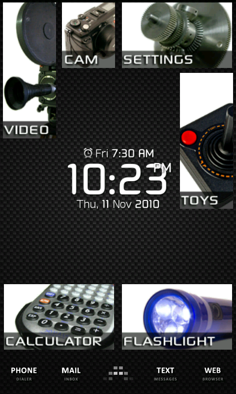
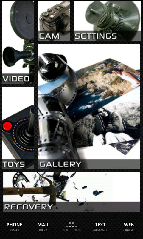
What's going on with the dock: There is no dock. Per se. It's a background I made. The goal was to have each screen organized in a theme of sorts, and the name of that theme on the dock. In the middle. That didn't work out so well, as you can see in the photos; on account of the dimensions. However, at least the screen indicator (grey line bar at the bottom) does fall somewhere on the correct name, as you switch screens. Almost like you meant for it to do that.

I originally tried creating a text icon with the screen theme's name, and applying that sole icon in the middle. But no matter how big I made the text, LauncherPro reduces it to a micro size that requires a magnifying glass to read, and you can't change the minimum setting of 5 icons on the dock, to make your single dock icon show larger. I noticed however that if LP is set to smooth scrolling (or NOT smooth scrolling, I forget), then my screen tag titles at the bottom all fit on a single sreen, and they can be made to center correctly on the grey screen indicator bar. But the text would have to change to visual (icon) representations of the titles, because there's not enough room to fit 6 titles on one screen. I will probably end up using this option. Note that I can still access my app drawer by swiping on the dock.

Considerations: The drawback to all of this is that the screens are now easily tampered with (whereas the way I had set it up before, they were hard to tamper with, once configured). Because with all of Launcher Pro's configuration options, there isn't a single one that allows you to lock the dock or screen icons, once you've got it all in place. Example: twice now, in a single day, I lost two of my beautiful screen widgets, just simply scrolling through the screens! Gone. Poof. So fast, I didn't even know what went missing. I just knew I had a black rectangle, indicating something had disappeared.

PaulMZ: I was certain that you could not get the notification dot to work on anything but LauncherPro's stock icons! Seems I had tried this and it did not work, but after seeing that your dot works on a custom dock icon, it's something I'll definitely have to try again.


5171629635_c08ab5a7af_b.jpg

5171629873_24fb11f227_b.jpg

5172232724_e326cd5309_b.jpg

5171630307_bfeb3e1869_b.jpg

5172233136_e1f7832381_b.jpg

5172233308_cd14b1b5d7_b.jpg


Translations:
historique d'appel: call history
le prix du gaz: gas buddy (app)
la realite augmentee: layar
prez de moi: places
localisateur de voiture: car finder
enregistreur de voix: voice recorder
e-lecteur: e-reader
detente sons: easy relaxation sounds
 
Upvote 0
My home screens so far (with w7 icons on)
Again, can't get the images to show directly!

choccy:

Everything seems to be coming along fine... I think you're getting the hang of it.

Now for the critique (don't think less of me and, of course, feel free to ignore me completely)...

The text on the "shopping" (as well as the "tools", "ebay" and "comics") icon came out perfect, but it looks like the "hockey" and "media" ones are in lowercase instead of uppercase.

Don't forget to set the "Auto-Fit Items" option in LauncherPro (if that is what you're using). See: UPDATE: Enable LauncherPro Auto-Fit Option for Android 7 Theme post if you need to know.

Finally, and this one will help you out with future posts, when you're posting images using ImageShack, post the link that is listed under "Embed This Image" -> "Forum".

Overall, good work! Let me know if you need any help.
 
Upvote 0
Great stuff. Is Launcher Pro Plus needed to do all of this. Sizes seem off on my Fascinate.

II Kings:

In answer to your question, let me quote from Post 1, Page 1:

"No LauncherPro widget resizing is necessary!"

However (there is always an exception), if you want to make widget sizes other than the standard ones that Desktop Visualizer uses, you will need the paid upgrade for LauncherPro Plus in order to resize the widgets after placing them. See this post for why and how to do this: Image Resizing Using Photoshop.

Although, I would recommend purchasing LauncherPro Plus at least for the sole reason of supporting the developer of this awesome application.

We can try and help to figure out why your "sizes seem off" if you post some full-size screenshots of your layout. The only things I can immediately think of are: 1-Make sure you're using the correct sized image dimensions or images for your device's resolution (Fascinate=480x800, same as the Incredible, should work the same), 2-Make sure you have the "Auto-Fit Items" options set in LauncherPro (see this for details: UPDATE: Enable LauncherPro Auto-Fit Option for Android 7 Theme).

Hope this helps. Please post again if you need more help.
 
Upvote 0

BEST TECH IN 2023

We've been tracking upcoming products and ranking the best tech since 2007. Thanks for trusting our opinion: we get rewarded through affiliate links that earn us a commission and we invite you to learn more about us.

Smartphones