• After 15+ years, we've made a big change: Android Forums is now Early Bird Club. Learn more here.

OS "Polish" Apple v Android

I'm not a developer or anything, so I really don't know. I wonder how much of this type of thing has to do with Android having to run on so many different devices? iOs only has to run on one device.

Generally, I agree, now that I understand what people are talking about when they say "polish" in an OS, that Android still has a little work to do. The copy/paste issue, consistency in operation, navigating menus and UI elements all need to be fixed.

But I don't need everything to _look_ the same across all my apps like it does on the iPhone. First of all, when you can use a different browser, different music player, different email client, different SMS client, etc for all those "core function" apps that Apple will never let into the app store, I don't see how that'd be possible. A different look and interface is actually what they are after there, to differentiate themselves. That is exactly what Apple does not want. They have "perfected" their look and interface.....gob forbid anyone should mess with it. But all the alternatives are part of what draws me to Android. I want to be able to choose what works best for me, not let the Steve tell me what's best.
 
Upvote 0
But I don't need everything to _look_ the same across all my apps like it does on the iPhone. A different look and interface is actually what they are after there, to differentiate themselves. That is exactly what Apple does not want. They have "perfected" their look and interface.....gob forbid anyone should mess with it. But all the alternatives are part of what draws me to Android. I want to be able to choose what works best for me, not let the Steve tell me what's best.

I think there is still this misconceptions that all the iOS apps "look" the same. That is completely wrong. There is a lot of creative looking apps but their operations are the same. For example, the back button on Android sometime exit the app and sometimes it returns to the previous menu. That is what I am talking about when I refer to consistency.

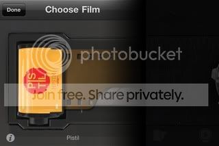
There are some apps on the iOS that do not use Apple list-styles or modal buttons and look absolutely fabulous. For example, look at Hipstamatic (Hipstamatic iPhone App - Digital Photography Never Looked So Analog). The hipster camera app acts and looks like a vintage lomo camera. It clearly uses multi-touch swipes to interact with the app. You change lens by swipes and so forth.

67af3625.jpg


It is a very polished app and so many people want this on Android but can't get it.
Despite its quirky interface, it is still very intuitive and you don't need to second guess how to use it.


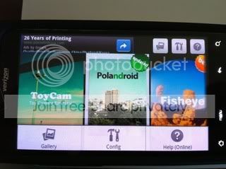
Now, for comparison, look at the Android clone version, Fxcamera (stackrmobile: FxCamera). This is the best lomo-hipster toy camera on Android. Unfortunately, it can't even compete with the worst iOS toy lomo camera app.

Why does that app need to have the gallery,menu and help icons on the top on the home screen when you press the physical menu button, you get the same thing?
62f5cbfc.jpg


Furthermore,let me give a critique on this particular app. The first button (Gallery icon) takes you out of the app into the built in Photogallery app on your phone. In my case, it is the HTC Sense Gallery which has a completely different UI than FxCamera. The interface and buttons are completely different. I was completely baffled by the placement of the icon and it's intended purpose.

Now, the question is... What is the point of having the gallery icon if it doesn't do anything within the app? All the iPhone camera app I use that have a photo album browser actually does something with the photos. They allow you to import the photos into the app for post-processing.

On iOS, the APIS allow you to pull the browser and embed it in your app and allow you copy it back in a very consistent polished fashion. On Android, in the FxCamera example, when I press the gallery button, I see every photos on my flash card NOT related to any FXCamera photos I've taken. I see every web page cached thumbnails, every wallpapers, jpeg icon assets of other apps on my flash card, I see every mp3 album art but none of the pictures taken with FXCamera because... You know what, I don't have an SD card and FXCamera didn't store my pictures on the internal flash.

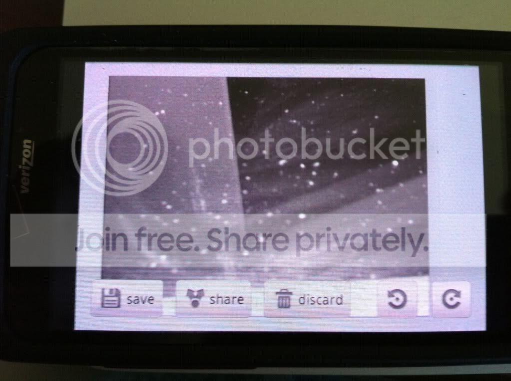
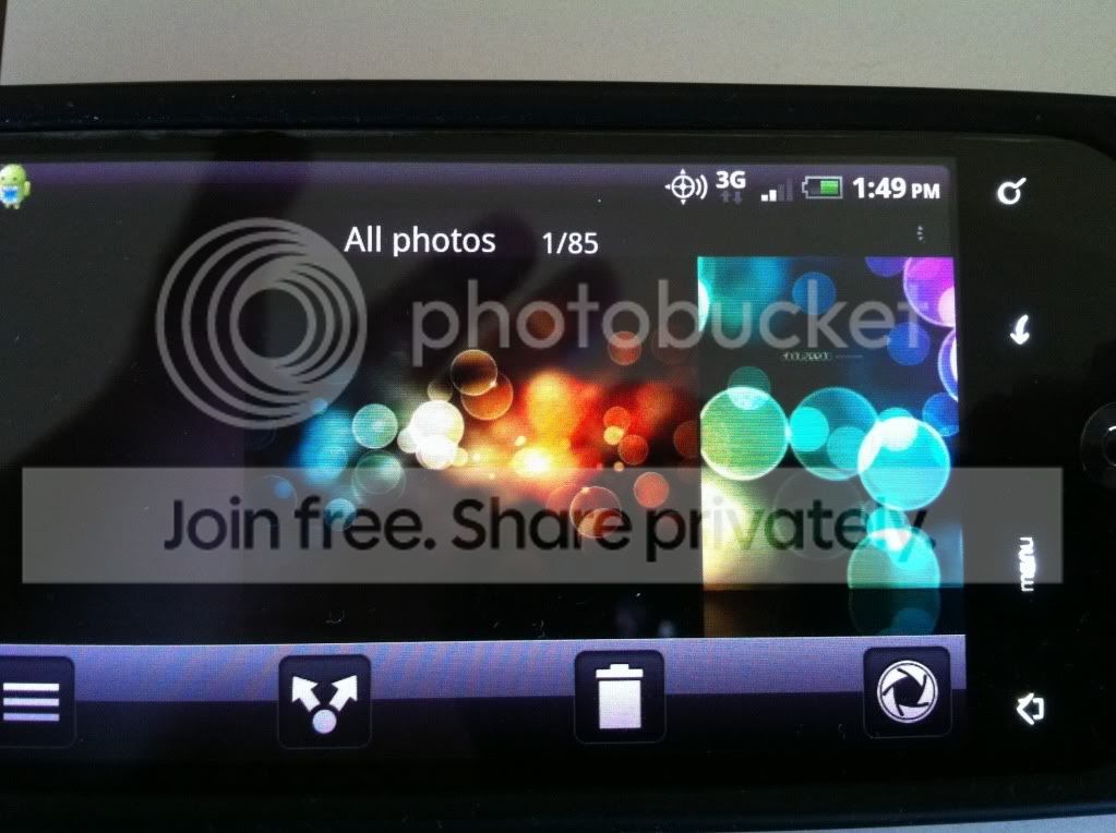
Now, within the very same app, FxCamera, the share/trash icons are completely different when you take a picture versus when you browse the gallery. On my phone, the "after taking the picture" it share button is opaque. On the gallery view it uses the HTC sense and it is black and twice the size of the other share button. Again, this is in the one app.

See the photos below. These are from within the same app, within the same session.

b620f2a6.jpg


cddc1291.jpg

This is an example of lack of polished on Android's supposedly best toy camera app.
 
Upvote 0
mrspeedmaster (btw is that a ref to a certain wristwatch, I wonder?) Thanks for taking the time to explain these issues.
I'm starting to see that I don't really know what I'm talking about. I'm not trying to argue. I'm here to learn. So I appreciate your input. So, I wonder, is it very difficult to put the sort of "polish" we're discussing here into an android app? Are the android app dev's just lazy? Or is there some other motivation for an apple app dev to work harder and better on their apps than for androids? Like for instance, Apple's notorious review process, vs android lack of one.
By the way, I know this isn't the place to discuss apps, but what do you think of this camera app?
http://www.appbrain.com/app/uk.co.neilandtheresa.Vignette#
I've heard good things, but I don't take many pics, so it wouldn't be much use to me for a paid app.

PS Just for the hell of it, I downloaded the free demo. I'm not gonna say its better than fxcamera....but it looks like it might be. There's a gallery button when you push physical menu, which takes you to a Vignette gallery (pics taken with the app are stored in a Vignette folder). You can import pics from your existing gallery too. I've only dinked around with it for a few minutes, but it seems pretty intuitive to me. I think it might be up your alley :)
 
Upvote 0
You are right about my screen name.

I looked at Vignette but it crashed way too much on my Incredible. On my Galaxy S, the built in camera app is better than anything on the market (including Camera 360). I much rather use the iPhone for cell phone photography because it is so much more enjoyable. You have a gazillion of quality quality cam apps.

So, I wonder, is it very difficult to put the sort of "polish" we're discussing here into an android app? Are the android app dev's just lazy? Or is there some other motivation for an apple app dev to work harder and better on their apps than for androids? Like for instance, Apple's notorious review process, vs android lack of one.

I can't really answer this. Joe Hewitt, the guy who developed facebook for iPhone, called Android development atrocious or something to the effect on twitter and every Android blog picked up on it. You should have seen the hundreds of nasty response. Hey, facebook on iPhone rocks. It is better than the website. Facebook on Android, simply sucks. I know he had no part of it but he got the slack of wrath for it.

The only side-by-side app that matches or is comparable to the iPhone is the official Android twitter one. That one is good. But if you look at the other apps from the big websites, the iPhone version is always better. Why? Could Hewitt be correct?
Let see:

Ebay iPhone is better than the Android version.
Amazon iPhone is better than the Android version.
Fandango iPhone is better than the Android version.
Flixster iPhone is better than the Android version.
Yelp iPhone is better than the Android version.
Pandora iPhone is better than the Android version.
Facebook iPhone is better than the Android version.

Could it be Hewitt is correct? Yes, many of these are web-apps but they are so much better on the iPhone. The Ebay and Amazon show so much more functionality on a 3.5 screen iPhone vs a 3.7 Incredible or 4" Galaxy.

There are simply too many clicks to get anything done.
Anyone here have a Captivate? Well check your web browser.
1) Hit the menu button
2) Hit More
3) Get a scrolling modal window which looks very sloppy, scroll to bottom
4) Hit settings
5) Click on Settings for something like text size.
6) You get another scroll window.

In each and every case, the color scheme, size of the fonts and lists changes. If you are in landscape, the text size only has 2 options: tiny and small unless someone tells you to scroll. You don't scroll because some of the lists modals don't allow you to. So, you wouldn't attempt to scroll.

Good User interface design is about anticipating the user's experience and clicks. A good designer wants to minimize the number of clicks to keep the user interested. If the user has been condition to do something because of a priori experience, you follow that. For example, we all know a trash icon signifies a deletion. That is what everyone has been conditioned to. Correct? You wouldn't use a trash icon to exit an app. That is what I mean. I'm just throwing that out as a hypothetical scenario.

I can't recollect where but someone used a red "x" to exit an app. It is the similar metaphor. The red "x" in HTC sense in the photo gallery app is used to "select" that image for deletion. So why would another developer use a red "x" to exit an app if the norm is used to signify deletion.

I used the Captivate web browser as an example because the first modal is grey on white. Then black on white. Then white on black. Then white on black with blue text. It is just a hodge-podge if you're accustomed to consistency.
 
Upvote 0
I see what your saying mrspeedmaster. And I do agree. Android does need more consistency. But then again, Android is incredibly consistent UI wise compared to my previous phone running Symbian. They could be all text based or literally fill the screen with icons. The only thing that remained the same between apps were the fact that they used a system font.

But I hate the way iOS does settings. To me, it defies what almost every other OS has done for years. All settings are always supposed to be in the app. I get why they would want settings to be in a centralized location, but it sort of pissed me off. Back before iOS could multitask, you had to stop what your doing, then go to the settings. I guess now its not nearly as bad with iOS 4, but still, I hated it. Fortunately, for my sake, some still did put it within the app itself, like Photobucket (that's actually one app that is nearly identical to the Android one in every way).

I suppose that 3.0, is supposed to make Android more polished, so hopefully that's true.

But what I'm not getting is the "X app is always better on the iPhone". I'm not really getting that. The Amazon app feels about equal to me, save for a few differences that are really not crucial to the app's functionality. Many of the others feel the same to me as well. Facebook on the iPhone is for sure better, but its the only platform that actually has a decent official Facebook app that I know of.
 
Upvote 0
But what I'm not getting is the "X app is always better on the iPhone". I'm not really getting that.

Lets use your previous example where you said the Photobucket is similar on both platforms. The Android version has about 80% of the functionality of the iPhone version. The Android version doesn't seem to take advantage of the inherent strengths of my Android phones due to fragmentation.

Example:
When you search for an item, and view an image on the iphone, you can pinch and zoom. You can't do that on any Android phone using Photobucket 1.3.1.

Now, I know why it doesn't do this and why the devs didn't add this in.. Fragmentation. My wife's old Backflip doesn't have capacitive multi-touch so the developers developed for the lowest common denominator.

More examples from the same app: iPhone allows you to geotag, compress uploads during uploads. You can disable ads if you have a pro photobucket account. iPhone version, you can add, create and edit albums on the fly. Again, these are pretty crucial functions. There are some nice features not on the Android version like the "insert a face." There are less clicks to get things done like getting the URLs/deleting an image. 1 click vs 2 clicks. It also allows you to upload a live photo vs one in your photo album. Again, I understand why some of these features are missing on the Android version. Not every Android phone has geo-tagging capabilities.

The difference may be small but they all add up when each and every single app inherently has more features on one platform vs the other.
 
Upvote 0
Well all this comparing on how a app function on both OS is just all a individual preference , i don't see how having to take a extra click which is just seconds make the other os better or polish.If its the iphone you enjoy then do so,if its android you love then so be it but don't try to tell me just because it doesn't function like the iphone it's less of a os.
 
  • Like
Reactions: IOWA
Upvote 0
Android does need more smoothness but is consistency really such a virtue? There is no consistent UI for the web and people manage just fine.

Bad analogy. Your browser back/forward button stays the same, no?

Well all this comparing on how a app function on both OS is just all a individual preference , i don't see how having to take a extra click which is just seconds make the other os better or polish.If its the iphone you enjoy then do so,if its android you love then so be it but don't try to tell me just because it doesn't function like the iphone it's less of a os.

This is what we mean by polish. Yeah its only an extra click and its not a big hassle but this is the difference between clunky and finesse. I'm not a developer but many that are will tell you that polish is just as difficult as developing the app itself.
 
Upvote 0
It's too bad there's so much defensiveness and snippy comments like:

People call iOS polished? It's the most bland, uninteresting thing I've ever used.


Unamused.

It's pretty clear that a lot of people, like the quoted poster here, have no idea what it means to be polished. Polished has nothing whatsoever to do with the actual underlying user interface. You can have an interesting UI that's polished, or a bland one. It's about making consistent and intuitive design choices. As long as there is this ridiculous knee-jerk resistance to the mention of the word "Apple" or "iPhone", comparisons will continue to be met with hard headed dismissal when really, both sides would come away a lot stronger if they recognized each others' strengths and tried to grow from them.
 
  • Like
Reactions: jroc
Upvote 0

BEST TECH IN 2023

We've been tracking upcoming products and ranking the best tech since 2007. Thanks for trusting our opinion: we get rewarded through affiliate links that earn us a commission and we invite you to learn more about us.

Smartphones