• After 15+ years, we've made a big change: Android Forums is now Early Bird Club. Learn more here.

New Google Play Website

out of ideas

Android Enthusiast
May 19, 2012
639
144
anyone else seen the play store from a computer? it looks god awful, and I think it's gonna hurt devs.

Now if you search, you just see all the apps that match and all you get is the logo pic, so you will be buried within as many apps are in your keywords, with just logos to pic from.

when in an app's page, you get the description, then what appears to be 4 random reviews, and the reviews and ratings are heavily highlighted, whereas the convenient number chart is gone, it now just puts up what range it is in (installs 10,000-50,000) instead of seeing recent pattern changes. So you can't get a feel for it being a new app and gaining traction, you only see that it doesnt have many ratings, so an average user would just assume its no good.

worst of all, the "More From Developer" is now buried all the way at the bottom, below all the info AND below "similar apps". Seems like it would be much more likely to send someone to a different app of the same style, as opposed to driving people to be aware of your other apps.

thumbs down.
 
Pretty sure this is the second time this year they've changed it too. I liked it the way it was but apparently they're copying off of some company based in Washington and going for uniformity across all their products
Which is ironic given that Safari won't now load Google Play fully. No Search bar at the top and other items missing.
 
Upvote 0
What's been happening with Google recently? I've had difficulty getting apps from Play. And this morning Google Authenticator wouldn't work, like they forgot about it. I had to authenticate my log-in with an SMS from Google(even that's apparently changed, because it's always come from a Hong Kong +852 number, this morning it was from a Shenzhen 0755 number). And then re-activate the Authenticator once I was logged-in. I like the two-factor authentication they offer, just as long as it works and is reliable. Does anyone else use Authenticator?

I guess the rehash of Play might have something to do with the difficulties I've had in downloading apps.


Which is ironic given that Safari won't now load Google Play fully. No Search bar at the top and other items missing.

Seems to be complete here with Safari on a Mac at the moment. I'm seeing the search, and everything else that should be there.
 
  • Like
Reactions: Beards
Upvote 0
Seems to be complete here with Safari on a Mac at the moment. I'm seeing the search, and everything else that should be there.

I have a number of Tablets and on all my Android devices it shows fine, yet on my iPad using Safari it's a No No.
I know it's obviously Apple and Safari because if I use either Chrome or Dolphin on the iPad it loads properly.

I'm not too bothered, simply an observation but thanks for mentioning it.
 
  • Like
Reactions: mikedt
Upvote 0
It's the metro-fication of Android. They're taking cues from Windows phone and adapting it into a white background, pastel theme which I honestly don't want to see become Android 5.0. Partly inspired by WebOS and Google Now. The Gmail app alone is an oversized pastel Easter nightmare. Other apps are following suit, such as Yahoo! Mail and Dolphin Browser. If there was a way to theme the apps vs. Uninstalling them I wouldn't mind so much. It is like they expect a largely female demographic. I can't stand pastels
 
Upvote 0
And not dumbed down to some pastel crap with oversized elements for the vision impaired. Seriously what's the point in even buying a 10" tablet if over half the screen is taken up by cards, tiles in-app? To say nothing of how white on black is easier to look at as opposed to black on white, the older Play Store had white on black colors and offered a less-oversized UI


You're trying to view the desktop version Play on an Android mobile device? The large screen stuff does work well on a PC or Mac, and should indeed help the visually impaired. it's NOT designed for small touch-screen devices. Google expects you to be using the Play app.

I tried viewing the new desktop Play on a phone, it is difficult to use. But then I always use the Play app. As I'm always thinking with Android tablets in particular, what you get is the same as a phone, but just larger. Nick you got a 10 inch tablet, and it's showing exactly the same as a phone does.
 
Upvote 0
No, mike, I am talking of the newest version of Play Store, which has an oversized, card-based UI, along with the same theme carrying over to various apps, including non-Google apps. The website was merely revamped in the same vain. Gmail is particularly awful.


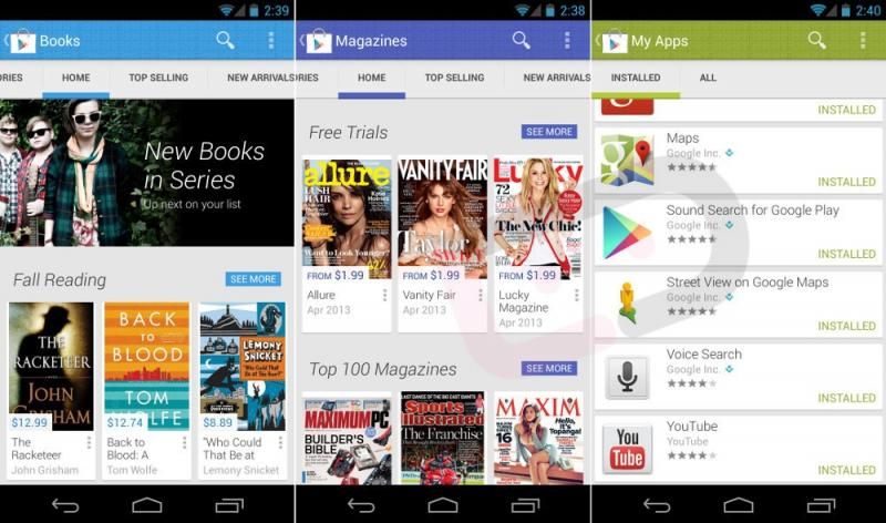
As is play store:


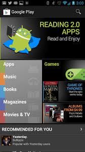
The old play Store looked better and offered more on a page. Also, it lacked the putrid pastels:
 
Upvote 0
No, mike, I am talking of the newest version of Play Store, which has an oversized, card-based UI, along with the same theme carrying over to various apps, including non-Google apps.

It's a tabbed and icon interface isn't it? The Android mobile app doesn't seem to have been changed. There's no updates, not that I've received since I bought the Samsung phone four weeks ago. And what you see on a tablet or phone is the same thing, except on a tablet you'll probably see more tabs and icons.

The website was merely revamped in the same vain. Gmail is particularly awful

If it's Gmail, and you're trying to use the desktop website. Why don't you use the Gmail app that should be already be on your tablet?

I think Google are pushing people towards using their apps. If you're using an Android phone or tablet, and not a PC or Mac.
 
Upvote 0
As I said, i use the app. Including the gmail app. The updated UI looks too large, and appears intended for visually impaired people. It also has this hideous pastel look and metro-inspired icon style

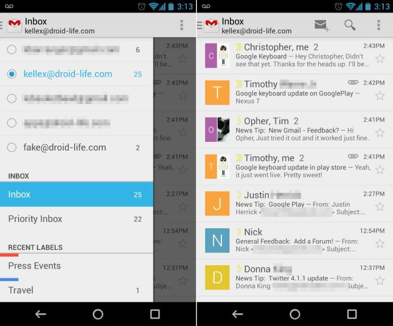
gmail app:


Essentially making a 7 inch tablet look like a 4 inch. High contrast white background with card-metroish pastel look. Unfortunately it's not just Google, many devs are using this theme and the user has zero say.

IANAL but I think that's something they've done to comply with accessibility laws...EU, USA, etc. You might not like it, Devs seem to like it though, although there's presumably recommended UI guidelines that they should follow. But with Android what you get on a tablet, is pretty much the same as a phone.

Don't know if you've ever looked at the accessibility features of Jellybean. It is completely accessible, even if one is totally blind and can't see the screen at all. And iOS is completely accessible as well for blind and visually impaired.
 
Upvote 0
Well my vision is great and I preferred the design prior to this Easter theme with all the whitespace and oversized fonts. If you ask me, Google is simply copying the same UI look that Windows uses. Dumbing down Android.

Is there a recent population explosion of visually impaired people I am unaware of? The Gmail app screenshot is a default look, no accessibility feature. No way to turn it off, so am I expected to accept this look that seems to slowly be working its way into Android? Forced to use a high-contrast, large iconed UI because some can't see?

Is the next version doomed to become a pastel card based hybrid of WebOS and Google Now? If so, Android is dead already.
 
  • Like
Reactions: Rico ANDROID
Upvote 0
I love the new theme design that Google has been implementing with the cards etc. It's clean and every app that has had this implemented has seen improved performance.

You also have to consider that Google wants to appeal to younger people and the more casual crowd and this kind of design is attractive. Though in all honesty I haven't seen anyone complain about this that much, even the more tech savvy people I know. I like it and it's certainly better than the horrid UI of the GB days.

Well my vision is great and I preferred the design prior to this Easter theme with all the whitespace and oversized fonts. If you ask me, Google is simply copying the same UI look that Windows uses. Dumbing down Android.

Is there a recent population explosion of visually impaired people I am unaware of? The Gmail app screenshot is a default look, no accessibility feature. No way to turn it off, so am I expected to accept this look that seems to slowly be working its way into Android? Forced to use a high-contrast, large iconed UI because some can't see?
Is the next version doomed to become a pastel card based hybrid of WebOS and Google Now? If so, Android is dead already.

Sure thing pal. You're acting like your preference is representative of all Android users and to someone new to Android your comments would get the false impression that most people don't like this design when it is in fact the opposite.
 
Upvote 0
If you like cards so much why not just use webos? It seems what with the oversized, large fonts that they are appealing to the visually impaired, not young folks. At least offer some way to decide instead of changing for the sake of change and forcing everyone to deal with it, like, well, Apple would. Personally pastels make me sick. It's a bit too feminine for me. Why buy a large ten-inch tablet just to have the UI waste all that space?

Android made it to #1 without copying Windows 8. Or looking like the latest interior design at Bath and Body Works.

What are you talking about? Tons of results for folks hating the Gmail and Play store updates are all over Google, with many downgrading. Also wasn't aware many folks were into pastels and light whites and grays.
 
  • Like
Reactions: Rico ANDROID
Upvote 0
1. If you like cards so much why not just use webos? 2. It seems what with the oversized, large fonts that they are appealing to the visually impaired, not young folks. At least offer some way to decide instead of changing for the sake of change and forcing everyone to deal with it, like, well, Apple would. Personally pastels make me sick. It's a bit too feminine for me. Why buy a large ten-inch tablet just to have the UI waste all that space?

Android made it to #1 without copying Windows 8. Or looking like the latest interior design at Bath and Body Works.

3. What are you talking about? Tons of results for folks hating the Gmail and Play store updates are all over Google, with many downgrading. Also wasn't aware many folks were into pastels and light whites and grays.

1. I don't care about webOS, i never used it before. Isn't it a dead OS for now anyway, LG probably has the same plans for it as Samsung does for Tizen but I like Android.

2. You're just over exaggerating, the fact that you can change font size renders that "oversized fonts" argument moot. No one I know has complained about this. I'm not sure if you really know what visually impaired means.

3. Lol those comments are in the minority, if what you say is true all the Google apps would have been downgraded considerably, yet they haven't. Because people like this look.
 
Upvote 0
Well my vision is great and I preferred the design prior to this Easter theme with all the whitespace and oversized fonts. If you ask me, Google is simply copying the same UI look that Windows uses. Dumbing down Android.

Is there a recent population explosion of visually impaired people I am unaware of?

I don't think so, but there are accessibility laws that companies and products have to comply with, although IANAL.

You're not going to start ranting about large buttons and braille in elevators are you? :smokingsomb:

The Gmail app screenshot is a default look, no accessibility feature. No way to turn it off, so am I expected to accept this look that seems to slowly be working its way into Android? Forced to use a high-contrast, large iconed UI because some can't see?

Is the next version doomed to become a pastel card based hybrid of WebOS and Google Now? If so, Android is dead already.

Just because you don't like it, don't know about anyone else. Looks OK to me. I don't think it's going to change anything. Android will still be number one, there's no doom, Android is not going to die, life will go on, and the world will keep on turning. :D

BTW Nick, you are one of my favourite posters on AF. :beer:
 
  • Like
Reactions: Rico ANDROID
Upvote 0
If it's Gmail, and you're trying to use the desktop website. Why don't you use the Gmail app that should be already be on your tablet?

I think Google are pushing people towards using their apps. If you're using an Android phone or tablet, and not a PC or Mac.

Apps are great when you have a device with lots of memory, power, etc, or if you use something all the time. When you have a limited device (like my Venture) you install only the apps that you use constantly; you tolerate web interfaces for things you use less. Such devices tend also to have small, low-res screens, so you kinda need a web interface that wasn't designed by Fisher-Price for toddlers and the elderly.

30904.jpg


The Gmail app screenshot is a default look, no accessibility feature. No way to turn it off, so am I expected to accept this look that seems to slowly be working its way into Android? Forced to use a high-contrast, large iconed UI because some can't see?

That is the real problem. No configurability. Go ahead and change the interface however you want, but give us the option to use the interface that we know works for us. Google is learning from Microsoft...does anyone remember when Office had a classic menu bar with all the commands placed consistently and semi-logically, instead of these damnfool "ribbons" with crap placed randomly and inexplicably? Want to insert something in Excel? Don't go to the Insert ribbon, there's no useful inserting commands there, they're in some other ribbon! That'd all be fine if they hadn't cut menus entirely out; Firefox and Opera come with the menu disabled by default but let you enable it.

Is the next version doomed to become a pastel card based hybrid of WebOS and Google Now? If so, Android is dead already.
Over the past few years the trend has been to make stuff look like it did back when CGA graphics came out; stuff like Desqview had these big blocky interfaces decades before tablets went mainstream and Microsoft made Metro.
dvxappmgr.gif


nickdalzell, tangentially speaking, I would recommend you don't buy a Pontiac car from the late 1990s. The controls were designed by Fisher-Price for toddlers and the elderly just like the GUIs that we're on about in here. Big knurled plasticky controls that have insufficient tactile feel to them...it was like the designers had a condescending attitude towards drivers or something.

Anyway I haven't noticed most of this crap with Google's stuff yet. I have automatic updates turned off for my phone so my apps stay old until they break and I delay getting stuck with crap like this. On the desktop using a web browser I usually have javascript disabled and/or classic themes selected.

Rant.gif
 
  • Like
Reactions: mikedt
Upvote 0

BEST TECH IN 2023

We've been tracking upcoming products and ranking the best tech since 2007. Thanks for trusting our opinion: we get rewarded through affiliate links that earn us a commission and we invite you to learn more about us.

Smartphones