
-
After 15+ years, we've made a big change: Android Forums is now Early Bird Club. Learn more here.
Screen Shots
- Thread starter alfick3
- Start date
-
- Tags
- lg spirit 4g


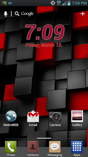
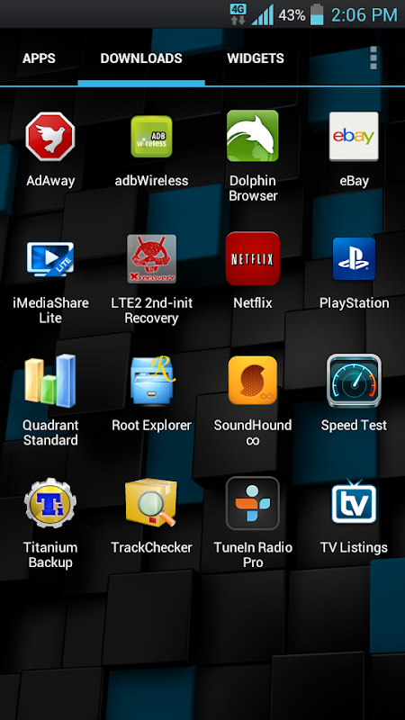
 And even after switching Icon themes these still don't match up very well.
 ")

")


BEST TECH IN 2023
We've been tracking upcoming products and ranking the best tech since 2007. Thanks for trusting our opinion: we get rewarded through affiliate links that earn us a commission and we invite you to learn more about us.
Smartphones
Best Android Phones
See All- Google Pixel 8 Pro Check Price
- Samsung Galaxy S23 Ultra Check Price
- Samsung Galaxy Z Fold5 Check Price
- Google Pixel 8 Check Price
- Samsung Galaxy S23 Check Price
Upcoming
See All
Best iPhones
See All- Apple iPhone 15 Pro Max Check Price
- Apple iPhone 15 Pro Check Price
- Apple iPhone 15 Plus Check Price
- Apple iPhone 15 Check Price
- Apple iPhone SE (2022) Check Price
Upcoming
See AllTablets

Best Tablets
See All- Samsung Galaxy Tab S9 Ultra Check Price
- Apple iPad Pro (2022) Check Price
- Apple iPad Air (2022) Check Price
- Apple iPad Mini (2021) Check Price
- Microsoft Surface Pro 9 Check Price
Upcoming
See AllLaptops

Best Laptops
See All- Apple Macbook Pro Check Price
- Apple Macbook Air (2023) Check Price
- Dell XPS 13 Check Price
- Acer Chromebook Spin 714 Check Price
- Dell Alienware m18 (2022) Check Price
Upcoming
See AllTelevisions

Best TVs
See All- Samsung The Frame TV Check Price
- Samsung Neo QLED 4K QN90C Check Price
- LG G3 OLED Check Price
- LG A2 OLED Check Price
- ROKU Plus Series Check Price
- Samsung S90C OLED Check Price
- SunBriteTV Veranda 3 Check Price
Upcoming
See AllGame Consoles

Best Game Consoles
See All- Nintendo Switch OLED Check Price
- Microsoft XBOX Series X Check Price
- Sony Playstation 5 Check Price
- Microsoft XBOX Series S Check Price
- Nintendo Switch Lite Check Price
Upcoming
See AllWearables

Best Wearables
See All- Oura Ring 3 Check Price
- Apple Watch Series 9 Check Price
- Google Pixel Watch 2 Check Price
- Samsung Galaxy Watch 6 Classic Check Price
- Fitbit Inspire 3 Check Price
- Amazfit Amazfit Band 7 Check Price
- Apple Watch SE Check Price
- Apple Watch Ultra 2 Check Price
