
We were so close. we already had seen the likes of 3-D looking UIs, full of features, screens with high PPI and resolution capability (and not just Apple's Retina Display either, try Samsung's AMOLED display). but now it seems that UI design is going backwards to the early days of computing:
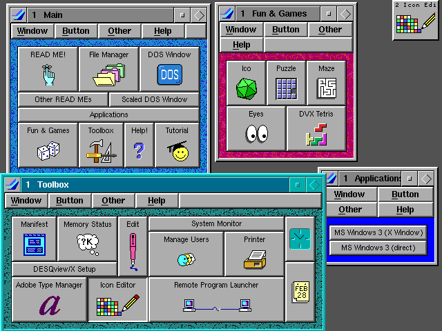
Desqview 1980s:
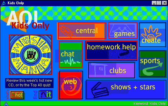
AOL 1990s:
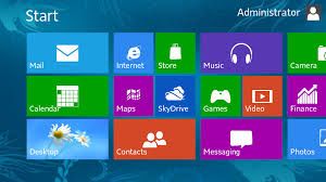
Windows 8 (present day):
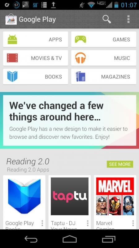
Android's Play Store and various apps (and possibly future Android itself):
BlackBerry 10:
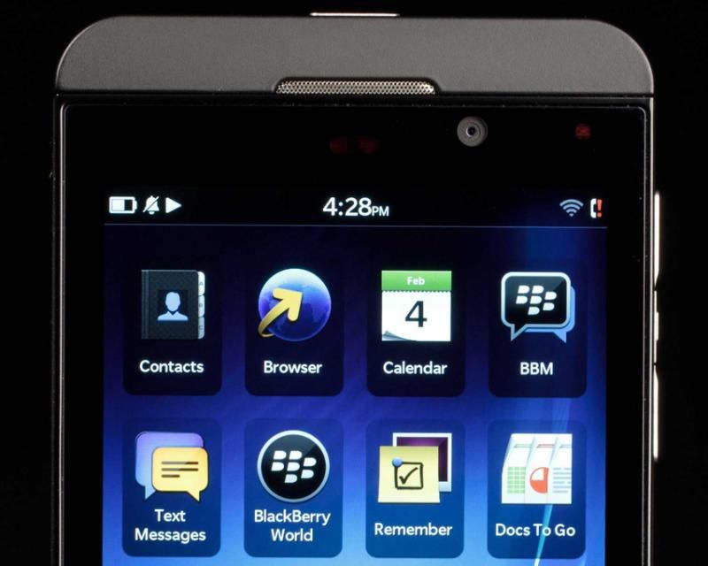
What is it with the huge icons, dumbed down UI, and colorful toy-like look? what's the point of all this new screen tech when it's wasted on a rehash and modern take on 1980s-90s computing? somehow, i am not surprised to see a Stylus on a Note anymore. everything else has started to devolve backwards. is this a fad or is this the way computing is going from now on?
Desqview 1980s:

AOL 1990s:

Windows 8 (present day):

Android's Play Store and various apps (and possibly future Android itself):

BlackBerry 10:

What is it with the huge icons, dumbed down UI, and colorful toy-like look? what's the point of all this new screen tech when it's wasted on a rehash and modern take on 1980s-90s computing? somehow, i am not surprised to see a Stylus on a Note anymore. everything else has started to devolve backwards. is this a fad or is this the way computing is going from now on?


 ...and its presence could actually obscure or detract from the information.

 haha
haha


